Pyhtnon: 2D Dengsity Plot© Karobben

Pyhtnon: 2D Dengsity Plot

Pyhtnon: 2D Density Plot

Easiest way in seaborn

In seaborn, you can plot the 2D density plot with minimal codes. But it talks for a while to calculate the distribution and fit them into plots.

More details for seaborn: Click here

import seaborn as sns
geyser = sns.load_dataset("geyser")
sns.kdeplot(data=geyser, x="waiting", y="duration", hue="kind")
© Seaborn

Pictures from: © Seaborn

fill=True levels=5, thresh=.2 fill=True, thresh=0, levels=100, cmap="mako"

Tutorial from

Another amazing tutorial I found is from Madalina Ciortan, 2019.

The quickist way

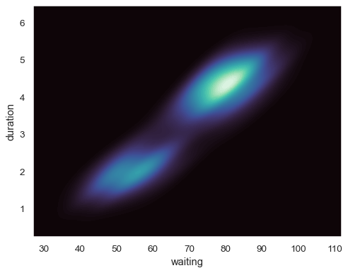
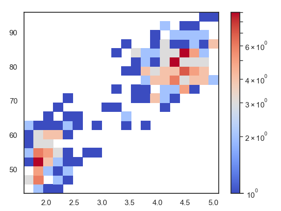
The quickist way to show the density distribution of all dots would be using matplotlib directly.

from matplotlib.colors import LogNorm
from matplotlib import pyplot as plt
h =plt.hist2d(geyser.duration, geyser.waiting,
bins= 30, norm=LogNorm(), cmap="coolwarm")
plt.colorbar(h[3])
plt.show()
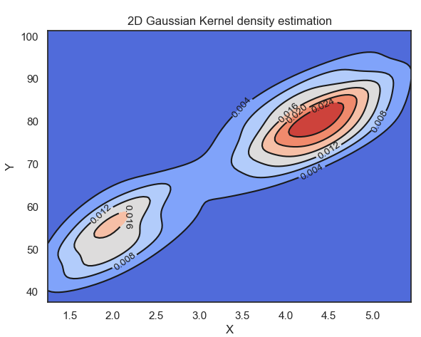
More fancy way

It would be take some time for fitting the gaussian kernel. But it still way fast than using Seaborn directly.


x = geyser.duration.to_numpy()
y = geyser.waiting.to_numpy()
deltaX = (max(x) - min(x))/10
deltaY = (max(y) - min(y))/10
xmin = min(x) - deltaX
xmax = max(x) + deltaX
ymin = min(y) - deltaY
ymax = max(y) + deltaY
print(xmin, xmax, ymin, ymax)# Create meshgrid
xx, yy = np.mgrid[xmin:xmax:100j, ymin:ymax:100j]
positions = np.vstack([xx.ravel(), yy.ravel()])
values = np.vstack([x, y])
kernel = st.gaussian_kde(values)
f = np.reshape(kernel(positions).T, xx.shape)
fig = plt.figure(figsize=(8,8))
ax = fig.gca()
ax.set_xlim(xmin, xmax)
ax.set_ylim(ymin, ymax)
cfset = ax.contourf(xx, yy, f, cmap='coolwarm')
#ax.imshow(np.rot90(f), cmap='coolwarm', extent=[xmin, xmax, ymin, ymax])
cset = ax.contour(xx, yy, f, colors='k')
ax.clabel(cset, inline=1, fontsize=10)
ax.set_xlabel('X')
ax.set_ylabel('Y')
plt.title('2D Gaussian Kernel density estimation')

from mpl_toolkits.mplot3d import Axes3D

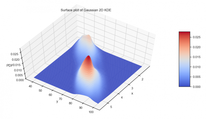
fig = plt.figure(figsize=(13, 7))
ax = plt.axes(projection='3d')
surf = ax.plot_surface(xx, yy, f, rstride=1, cstride=1, cmap='coolwarm', edgecolor='none')
ax.set_xlabel('x')
ax.set_ylabel('y')
ax.set_zlabel('PDF')
ax.set_title('Surface plot of Gaussian 2D KDE')
fig.colorbar(surf, shrink=0.5, aspect=5) # add color bar indicating the PDF
ax.view_init(60, 35)
XLliRg.md.png

Something else

There is another exmple from stackoverflow by Flabetvibes, 2015. It works fine with the example data. But I just don’t know how to adjust the arguments for fit my data.

import numpy as np
import matplotlib.pyplot as pl
import scipy.stats as st

data = np.random.multivariate_normal((0, 0), [[0.8, 0.05], [0.05, 0.7]], 100)

x = data[:, 0]
y = data[:, 1]
xmin, xmax = -3, 3
ymin, ymax = -3, 3

# Peform the kernel density estimate
xx, yy = np.mgrid[xmin:xmax:100j, ymin:ymax:100j]
positions = np.vstack([xx.ravel(), yy.ravel()])
values = np.vstack([x, y])
kernel = st.gaussian_kde(values)
f = np.reshape(kernel(positions).T, xx.shape)

fig = pl.figure()
ax = fig.gca()
ax.set_xlim(xmin, xmax)
ax.set_ylim(ymin, ymax)
# Contourf plot
cfset = ax.contourf(xx, yy, f, cmap='Blues')
## Or kernel density estimate plot instead of the contourf plot
#ax.imshow(np.rot90(f), cmap='Blues', extent=[xmin, xmax, ymin, ymax])
# Contour plot
cset = ax.contour(xx, yy, f, colors='k')
# Label plot
ax.clabel(cset, inline=1, fontsize=10)
ax.set_xlabel('Y1')
ax.set_ylabel('Y0')

pl.show()
© Flabetvibes
Author

Karobben

Posted on

2022-06-17

Updated on

2024-01-22

Licensed under

Comments