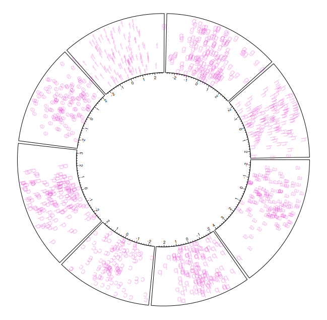
library(circlize)
set.seed(999)
n <- 1000
a <- data.frame(factors = sample(letters[1:8], n, replace = TRUE), x = rnorm(n), y = runif(n))
par(mar = c(1, 1, 1, 1), lwd = 0.1, cex = 0.6)
circos.par(track.height = 0.1)
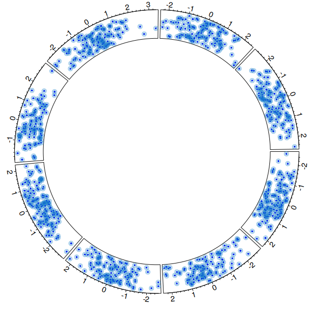
circos.initialize(factors = a$factors, x = a$x)
circos.trackPlotRegion(factors = a$factors, y = a$y,
panel.fun = function(x, y) {
circos.axis()})
col <- rep(c("#FF0000", "#00FF00"), 4)
circos.trackPoints(a$factors, a$x, a$y, col = col, pch = 16, cex = 0.5)
circos.text(-1, 0.5, "left", sector.index = "a", track.index = 1)
circos.clear()
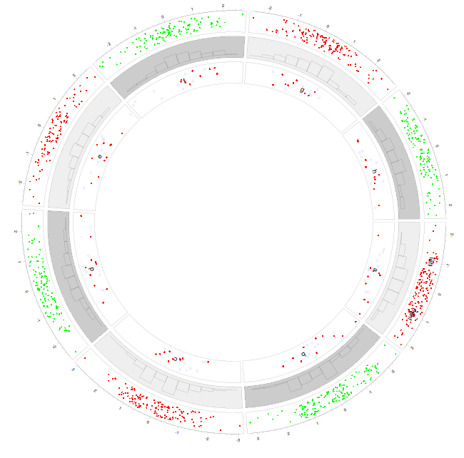
par(mar = c(1, 1, 1, 1), lwd = 0.1, cex = 0.6)
circos.par(track.height = 0.1)
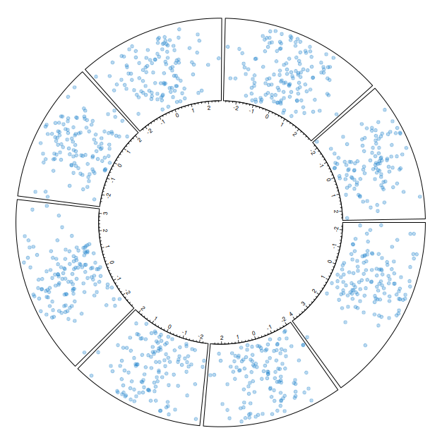
circos.initialize(factors = a$factors, x = a$x)
circos.trackPlotRegion(factors = a$factors, y = a$y,
panel.fun = function(x, y) {
circos.axis()})
col <- rep(c("#FF0000", "#00FF00"), 4)
circos.trackPoints(a$factors, a$x, a$y, col = col, pch = 16, cex = 0.5)
circos.text(-1, 0.5, "left", sector.index = "a", track.index = 1)
circos.text(1, 0.5, "right", sector.index = "a")
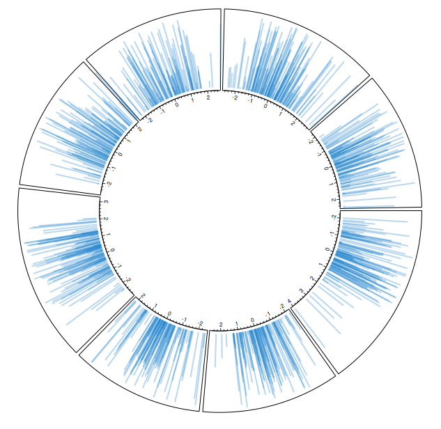
bg.col <- rep(c("#EFEFEF", "#CCCCCC"), 4)
circos.trackHist(a$factors, a$x, bg.col = bg.col, col = NA)
circos.clear()
par(mar = c(1, 1, 1, 1), lwd = 0.1, cex = 0.6)
circos.par(track.height = 0.1)
circos.initialize(factors = a$factors, x = a$x)
circos.trackPlotRegion(factors = a$factors, y = a$y,
panel.fun = function(x, y) {
circos.axis()})
col <- rep(c("#FF0000", "#00FF00"), 4)
circos.trackPoints(a$factors, a$x, a$y, col = col, pch = 16, cex = 0.5)
circos.text(-1, 0.5, "left", sector.index = "a", track.index = 1)
circos.text(1, 0.5, "right", sector.index = "a")
bg.col <- rep(c("#EFEFEF", "#CCCCCC"), 4)
circos.trackHist(a$factors, a$x, bg.col = bg.col, col = NA)
circos.trackPlotRegion(factors = a$factors, x = a$x, y = a$y,
panel.fun = function(x, y) {
grey = c("#FFFFFF", "#CCCCCC", "#999999")
sector.index = get.cell.meta.data("sector.index")
xlim = get.cell.meta.data("xlim")
ylim = get.cell.meta.data("ylim")
circos.text(mean(xlim), mean(ylim), sector.index)
circos.points(x[1:10], y[1:10], col = "red", pch = 16, cex = 0.6)
circos.points(x[11:20], y[11:20], col = "blue", cex = 0.6)})
circos.clear()
|