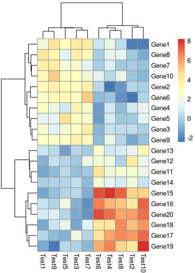
Pheatmap
Pheatmap
Quick Start
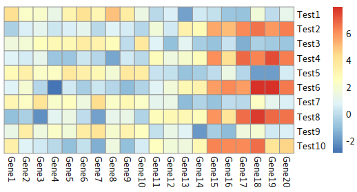
Create a matrix
|
         Test1       Test2    Test3       Test4    Test5      Test6    Test7      Test8    Test9     Test10
Gene1 3.113742  0.61097912 2.256865 -0.08655622 2.824332 -0.3824264 2.826347 -0.8726526 2.264322  1.9392831
Gene2 0.973717  0.03505342 2.681469  0.14051028 4.208013 -0.9295952 2.699840 -0.8473697 2.077007  0.2552222
Gene3 3.068895 -1.40479792 1.695945 -1.02215630 2.410066 -1.0977577 1.115832  2.4075234 3.305659 -0.4305648
Gene4 1.739518  0.43744627 3.438071  0.88019288 2.531289  0.5330686 3.914910 -1.5281725 3.853844  0.2501110
Gene5 3.500457 -0.76045729 3.161374 -1.09123751 3.486412 -2.8363874 3.362371 -1.3717895 3.585826  1.4036547
Gene6 3.385101 -0.45133918 3.537412 -2.23503436 1.783411  0.9475567 3.016503  0.4012510 1.886079  0.2387753
|
Arguments
Quick View:
pheatmap(mat, color = colorRampPalette(rev(brewer.pal(n = 7, name =
       "RdYlBu")))(100), kmeans_k = NA, breaks = NA, border_color = "grey60",
       cellwidth = NA, cellheight = NA, scale = "none", cluster_rows = TRUE,
       cluster_cols = TRUE, clustering_distance_rows = "euclidean",
       clustering_distance_cols = "euclidean", clustering_method = "complete",
       clustering_callback = identity2, cutree_rows = NA, cutree_cols = NA,
       treeheight_row = ifelse((class(cluster_rows) == "hclust") || cluster_rows,
       50, 0), treeheight_col = ifelse((class(cluster_cols) == "hclust") ||
       cluster_cols, 50, 0), legend = TRUE, legend_breaks = NA,
       legend_labels = NA, annotation_row = NA, annotation_col = NA,
       annotation = NA, annotation_colors = NA, annotation_legend = TRUE,
       annotation_names_row = TRUE, annotation_names_col = TRUE,
       drop_levels = TRUE, show_rownames = T, show_colnames = T, main = NA,
       fontsize = 10, fontsize_row = fontsize, fontsize_col = fontsize,
       angle_col = c("270", "0", "45", "90", "315"), display_numbers = F,
       number_format = "%.2f", number_color = "grey30", fontsize_number = 0.8
       * fontsize, gaps_row = NULL, gaps_col = NULL, labels_row = NULL,
       labels_col = NULL, filename = NA, width = NA, height = NA,
       silent = FALSE, na_col = "#DDDDDD", ...)
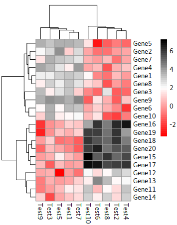
Color
|
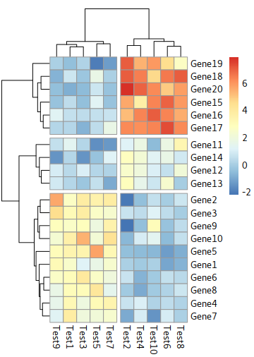
Dendrogram
|
Disable dendrogram
|
Cut trees
the parameters:
cutree_rows=int and cutree_cols=int
for example:
|
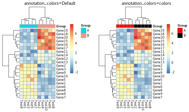
Group Annotation
In pheatmap, we use a matrix to store the annotaiton tags. An example you can see at below is Group which its rownames inhereted from colnames of test
Parameter about annotation
annotation_row = NA,
annotation_col = NA,
annotation = NA,
annotation_colors = NA,
annotation_legend = TRUE,
annotation_names_row = TRUE,
annotation_names_col = TRUE,
Example:
|
Group
Test1      A
Test2      B
Test3      A
Test4      B
Test5      A
|
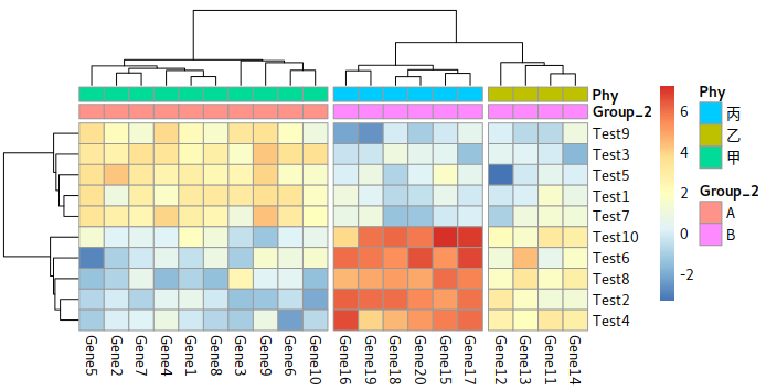
Two or more Layers of annotation
|
      Group_2 Phy
Gene1       A  甲
Gene2       A  甲
Gene3       A  甲
Gene4       A  甲
Gene5       A  甲
Gene6       A  甲
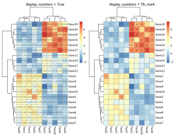
Display Numbers or Characters
display_numbers is the parameter we’d like to add.
|
Except for numbers, we can also adding characters,
for example:
|
Labels Annotation
|
Turn to ggplot
|
Heatmap for DEGs matrix
reference: Trinity
|
|
Parameters
mat:用来画热图的数据参数,一般是一个矩阵,数据是基因表达值,行代表基因,列代表样本。
color:表示颜色,用来画热图的颜色,可以自己定义,默认值为colorRampPalette(rev(brewer.pal(n = 7, name =”RdYlBu”)))(100),RdYlBu也就是Rd红色,Yi黄色,Bu蓝色的过度,则主调色为红黄蓝。
scale:是指对数值进行均一化处理,在基因表达量的数据中,有些基因表达量极低,有些基因表达量极高,因此把每个基因在不同处理和重复中的数据转换为平均值为0,方差为1的数据,可以看出每个基因在某个处理和重复中表达量是高还是低,一般选择做row均一化。
clustering_method:表示聚类方法,值可以是hclust的任何一种,如”ward.D”,”single”, “complete”, “average”, “mcquitty”, “median”, “centroid”, “ward.D2″。
cluster_rows:表示行是否聚类,值可以是FALSE或TRUE
clustering_distance_rows:行距离度量的方法,如欧氏距离
cutree_rows:行聚类数
treeheight_row:行聚类树的高度,默认为50
gaps_row:对行进行分割,就不应对相应的行进行聚类
cluster_cols:表示列是否聚类,值可以是FALSE或TRUE
clustering_distance_cols:列距离度量的方法
cutree_cols:列聚类数
treeheight_col:列聚类树的高度,默认为50
gaps_col:对列进行分割,就不应对相应的列进行聚类
legend:逻辑值,是否显示色度条,默认为T
legend_breaks:显示多少个颜色数值段
legend_labels:对色度条上对应位置的字符进行修改
annotation_colors:对标签的颜色进行修改
annotation_legend:是否显示标签注释条
annotation_row:数据框格式,用来定义热图所在行的注释条
annotation_names_row:逻辑值,是否显示行标签名称
annotation_col:数据框格式,用来定义热图所在列的注释条
annotation_names_col:逻辑值,是否显示列标签名称
main:设置图的标题
fontsize:是设置所有除主图以外的标签的大小
number_color:字体的颜色
show_rownames:是否显示行名
fontsize_row:行名的字体大小
labels_row:X轴坐标名设置
show_colnames:是否显示列名
fontsize_col:列名的字体大小
labels_col:y轴坐标名设置
fontsize_number:小格子中数字大小
display_numbers:逻辑值,是否在小格子中显示数字
number_format:小格子中数字显示形式,但仅有在display_numbers=T时才能使用
na_col:设置小格子为缺失值时的颜色
cellwidth:表示每个小格子的宽度
cellheight:表示每个小格子的高度
filename:输出图画的文件名
width:输出图画的宽度
height:输出图画的高度
Reference: Davey1220 2018