Go Ontology Bar Plot by ggplot

Go Ontology Bar Plot by ggplot

Data

Before running the codes, I’d like to have a brief introduces about my data.

There are three tables in total and name as In_all.table, Li_all.table, Mu_all.table.
It looks like:

Name InCK_30 InCK_75 In30_75 Cate
localization 114 149 94 Biological process
single-organism process 285 357 225 Biological process
metabolic process 375 413 261 Biological process
multi-organism process 4 5 1 Biological process
immune system process 15 13 9 Biological process
multicellular organismal process 16 13 11 Biological process
cellular process 411 473 296 Biological process
reproduction 0 1 1 Biological process
reproductive process 0 1 1 Biological process

Quick Start

library('ggplot2')
library('reshape2')

theme_go <- theme(axis.text.x=element_text(angle=60,hjust=1),
axis.title.x=element_text(hjust=0),
plot.title = element_text(hjust = 0.5),
panel.grid.major =element_blank(),
panel.grid.minor = element_blank(),
panel.background = element_blank(),
axis.line = element_line(colour = "black"))

### Intestine

all <- read.table("In_all.table",sep='\t',header=T)
all_gg <- melt(all)

p1 <- ggplot(data=all_gg)+
geom_bar(aes(x=Name,y=value,fill=variable),stat="identity")+
facet_grid(. ~ Cate,scales = "free_x",space = "free") +
labs(title="Intestine", x = "A", y="Countes")+ theme_go+
theme(axis.text.x = element_text(size=15))
ggsave('GP_Q.png',wi=12,hei=7.4)

NK5SeS.png
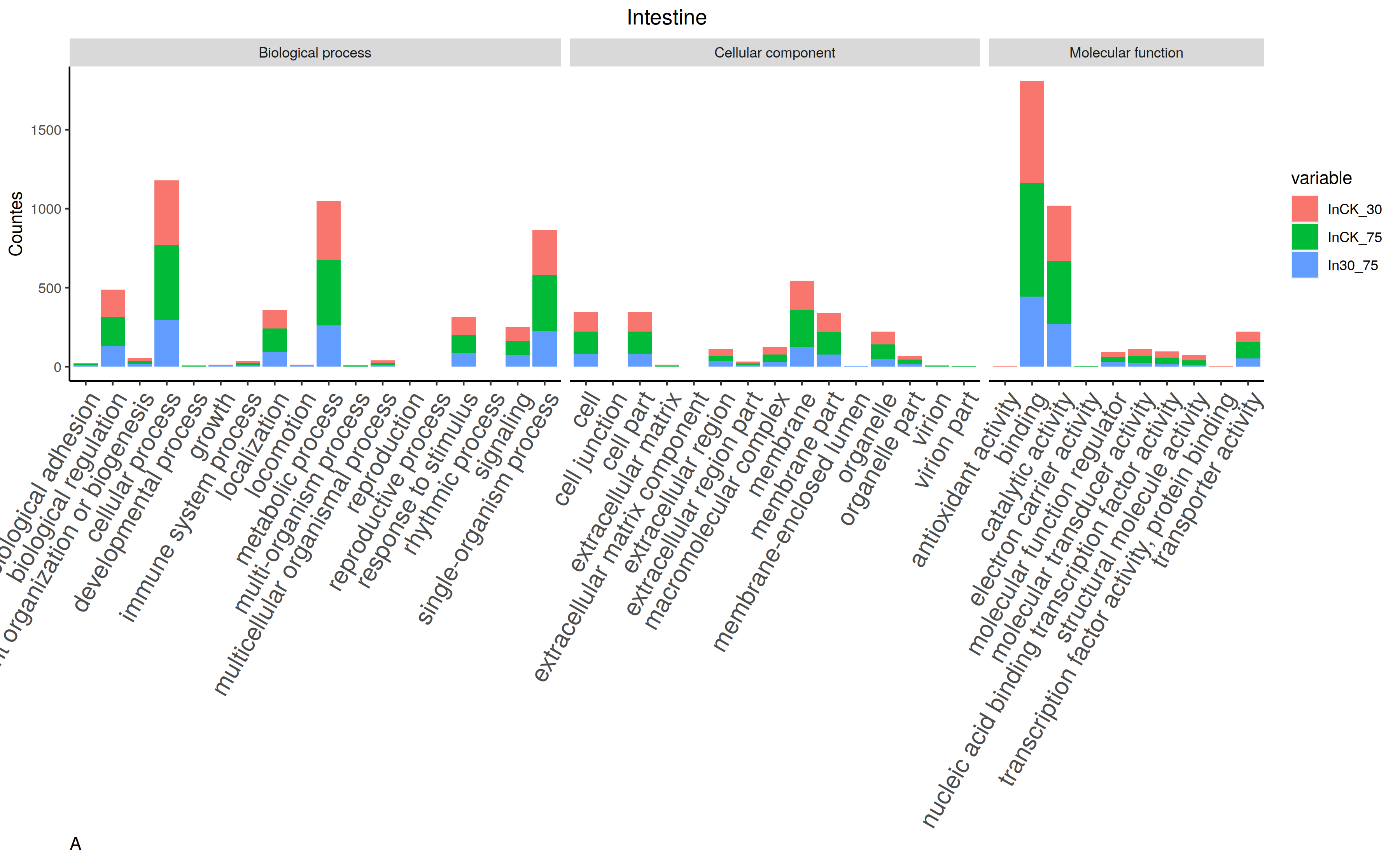
It is definitely the best result of GO bar plot.
But, thing gonna change when you want to align two or more others.
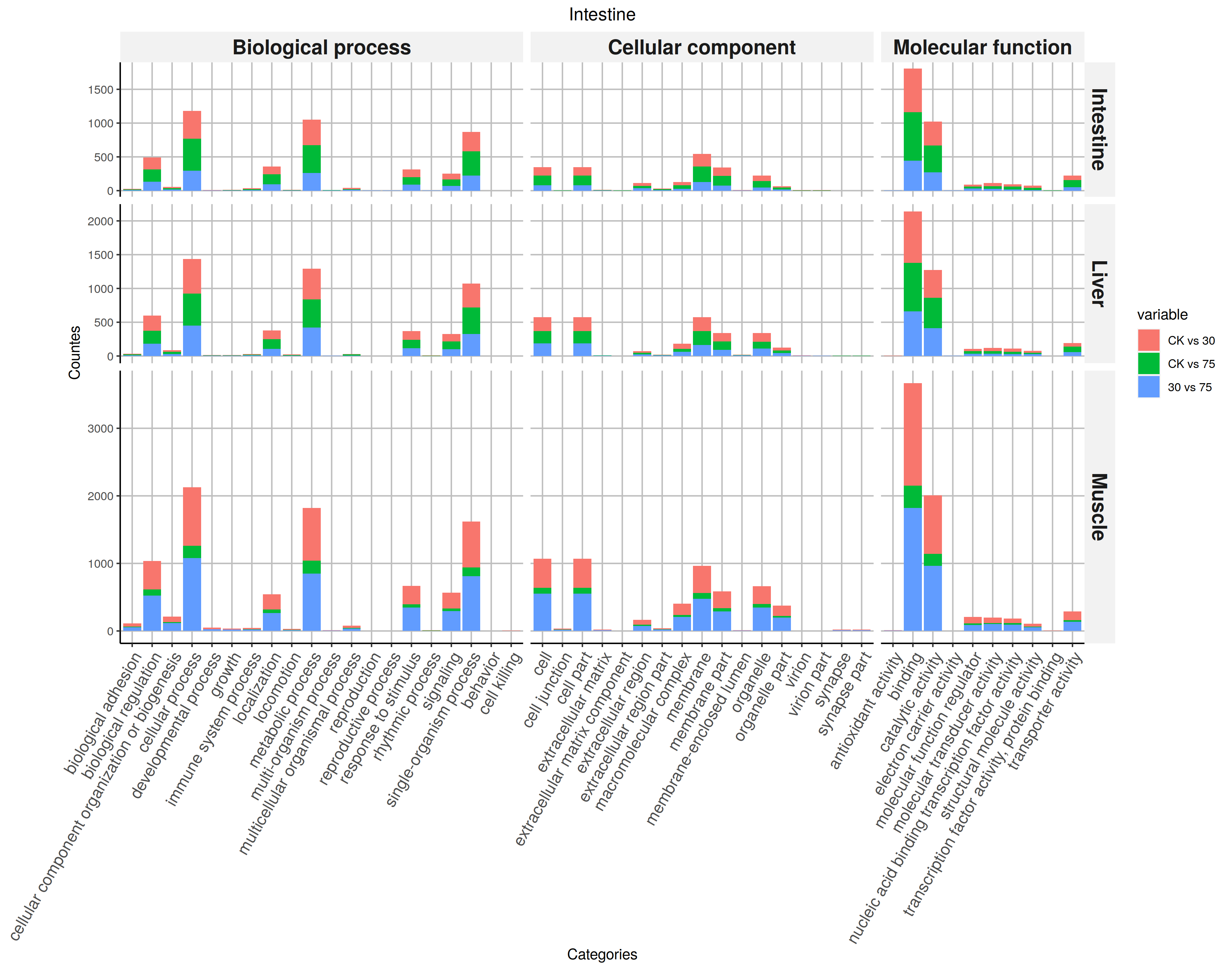
Plot Three files

library('ggplot2')
library('reshape2')

theme_go <- theme(axis.text.x=element_text(angle=60,hjust=1,size=12),
axis.title.x=element_text(hjust=0),
plot.title = element_text(hjust = 0.5),
panel.grid.major =element_blank(),
panel.grid.minor = element_blank(),
panel.background = element_blank(),
axis.line = element_line(colour = "black"))

### Intestine

all <- read.table("In_all.table",sep='\t',header=T)
all_gg <- melt(all)

p1 <- ggplot(data=all_gg)+
geom_bar(aes(x=Name,y=value,fill=variable),stat="identity")+
facet_grid(. ~ Cate,scales = "free_x",space = "free") +
labs(title="Intestine", x = "A", y="Countes")+ theme_go

### Liver
all <- read.table("Li_all.table",sep='\t',header=T)
all_gg <- melt(all)

p2 <- ggplot(data=all_gg)+
geom_bar(aes(x=Name,y=value,fill=variable),stat="identity")+
facet_grid(. ~ Cate,scales = "free_x",space = "free") +
labs(title="Liver", x = "B", y="Countes")+ theme_go

### Muscle
all <- read.table("Mu_all.table",sep='\t',header=T)
all_gg <- melt(all)

p3 <- ggplot(data=all_gg)+
geom_bar(aes(x=Name,y=value,fill=variable),stat="identity")+
facet_grid(. ~ Cate,scales = "free_x",space = "free") +
labs(title="Muscle", x = "C", y="Countes")+ theme_go


p1/p2/p3
ggsave("GO.png", wi=10,height = 15)

Due to the name of categories are long and dense, it is hard to get an idea distribution of the chart.
NKo2Gj.png

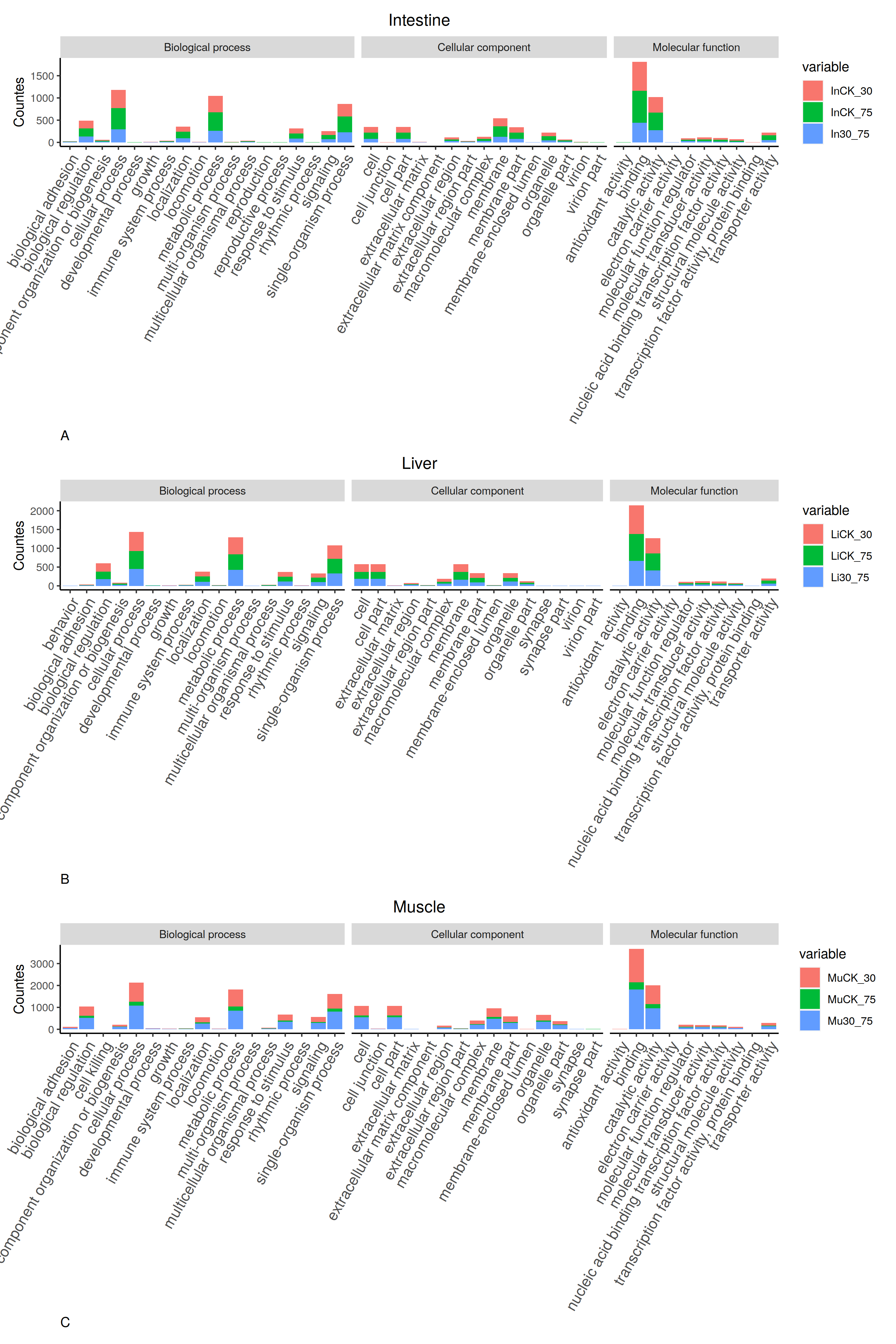
One resolution is to combine three tables and sharing one X axis. Another is to annotate the categories at the side of the chart.

Combining X axis

theme_go <- theme(axis.text.x=element_text(angle=60,hjust=1,size=12),
#axis.title.x=element_text(hjust=0),
plot.title = element_text(hjust = 0.5),
panel.grid.major =element_line(colour='grey'),
#panel.grid.major =element_blank(),
panel.grid.minor = element_blank(),
panel.background = element_blank(),
axis.line = element_line(colour = "black"))


File_list = c("In_all.table", "Li_all.table", "Mu_all.table")
Samples_list = c("Intestine", "Liver", "Muscle")
Degree_list = c("A","B","C")
TB = data.frame()
## Combining tables

for(i in c(1:length(File_list))){
tmp = read.table(File_list[i],sep='\t',header=T)
tmp$Samples= Samples_list[i]
colnames(tmp)[2:4]=c("CK vs 30", "CK vs 75", "30 vs 75")
TB = rbind(TB,tmp)
}

TB_melt <- melt(TB)
p <- ggplot(TB_melt)+
geom_bar(aes(x=Name,y=value,fill=variable),stat="identity")+
facet_grid(Samples ~ Cate,scales = "free",space = "free") +
labs(title="Intestine", x = "Categories", y="Countes") + theme_go

p <- p + theme( strip.background = element_rect(fill = '#f2f2f2'), strip.text = element_text(face = 'bold',size=15))
## we using cowplot to extent the axis
library(cowplot)
ggdraw() + draw_plot(p,0.05,0,0.95)
ggsave("GO_2.png",wi=12.7,hei = 10)

NKXdDs.png

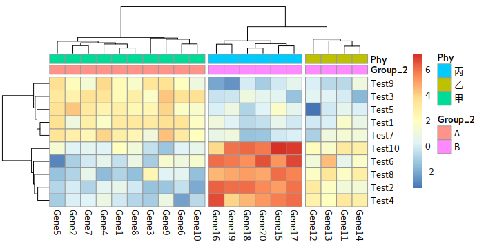
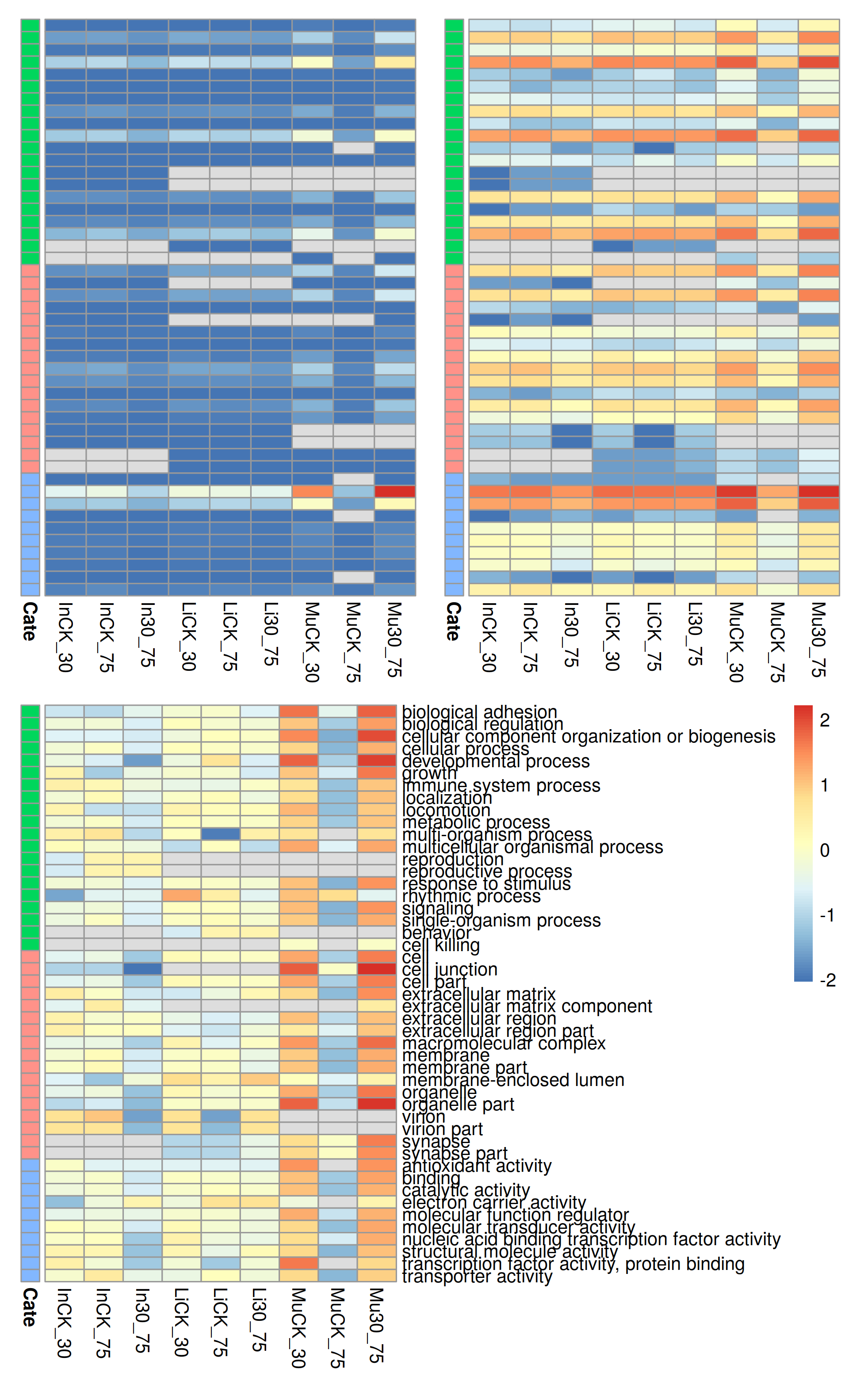
You may also like using heatmap to display the difference of counts among samples.

Heatmap

library(pheatmap)
library(ggplotify)
library(ggplot2)
library(reshape2)
library(patchwork)

## reading from data
all_In <- read.table("In_all.table",sep='\t',header=T)
all_Li <- read.table("Li_all.table",sep='\t',header=T)
all_Mu <- read.table("Mu_all.table",sep='\t',header=T)

## Merge
In_Li = merge(x=all_In,y=all_Li,by="Name", all.x = T, all.y = T)
In_Li_Mu = merge(x=In_Li,y=all_Mu,by="Name", all.x = T, all.y = T)

## Group
In_Li_Mu = In_Li_Mu[c(1,2,3,4,6,7,8,10,11,12,5,9,13)]
In_Li_Mu[13][which(is.na(In_Li_Mu[13])==TRUE),]=In_Li_Mu[12][which(is.na(In_Li_Mu[13])==TRUE),]
In_Li_Mu[13][which(is.na(In_Li_Mu[13])==TRUE),]=In_Li_Mu[11][which(is.na(In_Li_Mu[13])==TRUE),]
In_Li_Mu = In_Li_Mu[c(1:10,13)]

row.names(In_Li_Mu) = In_Li_Mu[[1]]


## Order
In_Li_Mu = In_Li_Mu[order(In_Li_Mu[[11]]),]
## Using raw counts
p1 <- pheatmap(In_Li_Mu[c(2:10)], annotation_row =In_Li_Mu[11],cluster_rows = F, cluster_col=F, labels_row = "", legend = F, annotation_legend = F)
## Normalizing it with Log2(x+1)
p2 <- pheatmap(log(1+In_Li_Mu[c(2:10)]), annotation_row =In_Li_Mu[11],cluster_rows = F, cluster_col=F, labels_row = "", legend = F, annotation_legend = F)
## Centering the matrix after log them
p3 <- pheatmap( data.frame(t(scale(t(log2(1+In_Li_Mu[c(2:10)])), scale=F))), annotation_row =In_Li_Mu[11],cluster_rows = F, cluster_col=F, annotation_legend = F)

g1 = as.ggplot(p1)
g2 = as.ggplot(p2)
g3 = as.ggplot(p3)

(g1|g2)/g3
##ggsave("GO_3.png",width = 6.54,height = 10.5)

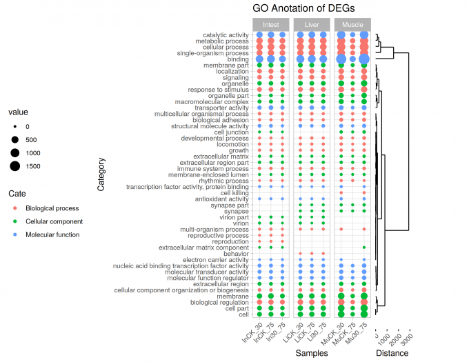
For have a better layout and easy to comparation, I tossed some legends.
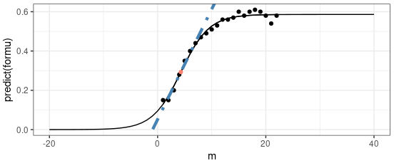
NMS9Ts.png

Dots plot

library(ggplot2)
library(cowplot)
library(ggdendro)

TB_tree <- In_Li_Mu[2:10]
TB_tree[is.na(TB_tree)]=0
Tree <- hclust(dist(TB_tree))
dendr <- dendro_data(Tree, type="rectangle")
## plot the dendrogram; note use of color=cluster in geom_text(...)
p1 <- ggplot() +
geom_segment(data=segment(dendr), aes(x=x, y=y, xend=xend, yend=yend)) +
coord_flip() + labs(y="Distance")+
theme(axis.line.y=element_blank(),
axis.ticks.y=element_blank(),
axis.text.y=element_blank(),
axis.title.y=element_blank(),
axis.text.x=element_text(angle=45,hjust=1),
panel.background=element_blank(),
panel.grid=element_blank())


TB <- melt(In_Li_Mu)
TB$Name = factor(TB$Name,levels = unique(TB$Name[order(TB$Cate)]))
TB$SubG = "Intest"
TB$SubG[grep( "Mu", TB$variable)] = "Muscle"
TB$SubG[grep( "Li", TB$variable)] = "Liver"
TB$Name = factor(TB$Name, levels= dendr$labels$label)

p2 <- ggplot(TB,aes(x=variable,y=Name)) +
geom_point(aes(size=value,color=Cate))+ theme_light()+
facet_grid(~SubG, scales ="free", space = 'free') +
labs(x='Samples',y='Category',title = "GO Anotation of DEGs")+
theme(axis.text.x = element_text(angle = 45,hjust=1),
axis.text.y = element_text(size=12),
strip.text.x = element_text(size=12, face='bold'),
legend.position = 'left')

ggdraw()+ draw_plot(p1,0.784,0.0,0.1,0.972) +
draw_plot(p2,0,0.007,0.8)

ggsave('GO_Dots222.png', width = 9.4, height = 8.07)

NMWOc6.md.png

Author

Karobben

Posted on

2020-06-19

Updated on

2023-06-06

Licensed under

Comments