Hexo theme: icarus| Highly personalize it
Hexo Theme: Icarus
GitHub: Ruipeng Zhang
Document: PPOffice Blog
Current Version: 4.0.0
Install
|
Error Message
(node:19025) ExperimentalWarning: The fs.promises API is experimental
INFO  =======================================
██╗ ██████╗ █████╗ ██████╗ ██╗   ██╗███████╗
██║██╔════╝██╔══██╗██╔══██╗██║   ██║██╔════╝
██║██║     ███████║██████╔╝██║   ██║███████╗
██║██║     ██╔══██║██╔══██╗██║   ██║╚════██║
██║╚██████╗██║  ██║██║  ██║╚██████╔╝███████║
╚═╝ ╚═════╝╚═╝  ╚═╝╚═╝  ╚═╝ ╚═════╝ ╚══════╝
=============================================
INFO  === Checking package dependencies ===
ERROR Package bulma-stylus is not installed.
ERROR Package hexo-renderer-inferno is not installed.
ERROR Please install the missing dependencies your Hexo site root directory:
ERROR npm install --save bulma-stylus@0.8.0 hexo-renderer-inferno@^0.1.3
ERROR or:
ERROR yarn add bulma-stylus@0.8.0 hexo-renderer-inferno@^0.1.3
how to solve
|
Error Message
ERROR Package bulma-stylus's version (0.9.1) does not satisfy the required version (0.8.0).
how to solve
|
Stylize
After you run hexo new Notes, a file nameds as Notes.md would be created in source/_posts. The head a few lines would be exactly as you stored in ./scaffolds/post.md. As a result, you just need to change the words in that file to create your own model for all new posts. For example, I’ll add some new features and a style feature for text block by change this file.
|
icarus: To Do List
Before we started, there are a few other excellent posts I’d like to share with:
iMaeGoo 2020: 活用 Bulma 美化 Icarus 文章
Anyway, let’s follow the document first:
Document: PPOffice Blog
Optional:
_config.icarus.yml
RSS
- a, p, RSS span
|
It indicates you made it if you can see the code below:
...
INFO  Generated: 2020/06/10/R/WGCNA/index.html
INFO  Generated: atom.xml
INFO  Generated: 2019/08/13/R/edgeR/index.html
INFO  Generated: content.json
INFO  690 files generated in 21 s
Then, adding the path into _config.icarus.yml
|
Thumbnail & Cover[1]
thumbnail is the image show in recent
cover is the image show in main page
|
Index
|
Read More Button
|
Comment[2]
comment:
    type: utterances
    repo: Your-GitHub-Username/Your-Public-Repo-Name
    issue_term: pathname        # Required if issue_number is not set
    issue_number: 100           # Required if issue_term is not set. Every post can be mapped to a separate, manually-created GitHub issue.
    label: some-issue-label     # Optional
    theme: github-light         # Optional
    crossorigin: anonymous
log, favicon, and avatar
log is the img line with the action bar
|
Share
the easiest way:
|
baidu_analytics[3]
|
Anchor Sidebar
|
Math Function
|
Math Function Font Size
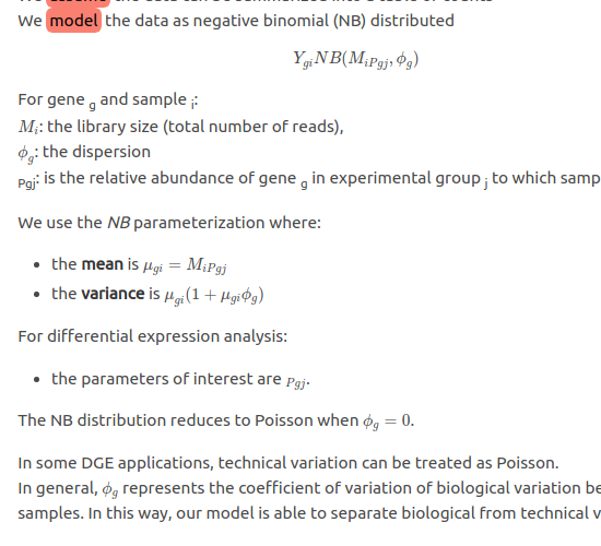
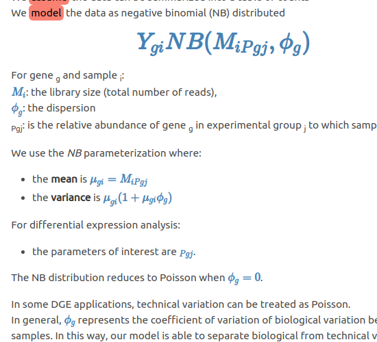
The default size of the math function is the same size as the article which makes the functions are hard to distinguish from the main page.
The easiest method to alter their font-size is adding something if themes/icarus/include/style/article.styl:
PS:
.mjx-chtmlworks on$$(double) quoted functions only..mjx-mathworks on both$$and$quoted function.
|
| Default Style | Changed Style |
|---|---|
 |
 |
Admonition
reference: lxl80/hexo-admonition
- install the plugin:
|
- add the codes at the end of
themes/icarus/include/style/article.styl:
|
- Use:
|
|
Hexo-admonition 插件使用示例
这是基于 hexo-admonition 插件渲染的一条提示信息。类型为 note,并设置了自定义标题。
提示内容开头留 4 个空格,可以有多行,最后用空行结束此标记。
warning
这是一条采用默认标题的警告信息。
Warning messages
r 嵌套链接及引用块
|
CC block
You can’t alter the infor from _config.icarus.yml because everything is recorded in _congig.yml…
|
edit the footer
You may can’t find the hexo-theme-icarus in your theme directory. So, for editing the role module, we can editing them in node_modules/hexo-theme-icarus
FlowChart & Mermaid
FlowChart and Mermaid: link
For icarus, hexo document didn’t give the resolution for jsx file.
So, I insert the <script src="https://unpkg.com/mermaid@8.8.4/dist/mermaid.min.js"></script> directly in themes/icarus/layout/common/scripts.jsx
|
It’s not the best resolution, but it works.
And a problem is it can’t show the whole word if the word is long.
Busuanzi
You can try to enable the busuanzi plugin in _congig.icarus.yml. But I have no idea why that it doesn’t work all the time. But it still doen’t work at first. Thanks for BoyInTheSun[4]. It seams like it conflicted to lived2d plugin. By solving this problem, the best solution is download the script to local and alter the script.
Before you do this, make sure you have called the busuanzi: false in _congig.icarus.yml or it won’t work.
Insert latest script inner the <div class="level-start"> tags at /themes/icarus/layout/common/footer.ejs file
The latest script you can find at BUSUANZI
|
Go check the raw codes. if it shows that <span id="busuanzi_container_site_uv" style="display: none;"> and nothing show at all, it means some plugin conflicted to it. You can fix this by following another post.
Visitors for each post[5]
This script is based on the Busaunzi script below
After you insert the codes below appropriately, we can add the codes below inner <div class="level-left"> in /themes/icarus/layout/common/article.jsx
|
Copyright announcement for Cover image[6]
Result:
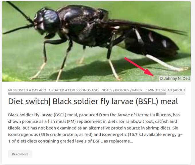
add a covercopy tag in the md header
|
Then, insert the codes below in card-image tag in themes/icarus/layout/common/article.jsx file as it’s show.
|
My example:
|
和瓦雀共存
瓦雀需要summary.md做index界面, 需要(可選) layout.md 做統一落款, 用 yuque.yml 做配置文件
如果直接使用, 則會出現如下圖片情況:
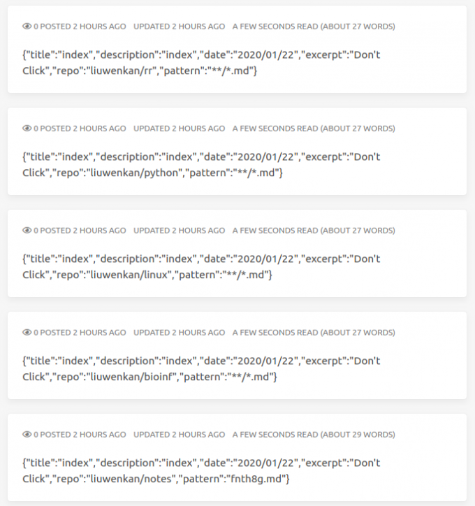
這些文件都會被渲染且置頂(因爲沒有時間). 非常難受.
查閱後可知, hexo 自帶的 skip_render 可以完美解決此方案. 因此, 只需要在_config.yml 中, 添加通配字符, 即可解決次問題.
|
之後, 記得 清除緩存, 再查看效果
|
用 python 腳本輔助更新語雀筆記: 腳本鏈接
Change the Size of the Logo
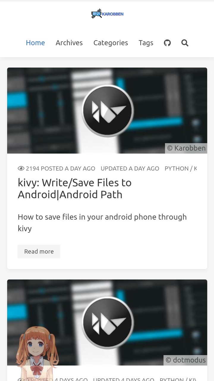
The size of the default logo was too small to fit the cell phone page.
So, I tried to alter the height from the raw code. But nothing happened. By retrieving the element one by one, you’ll finally find that it sited an argument of max-height: 1.75rem for this class. The quick solution is to set a new value for max-height in themes/icarus/include/style/navbar.styl.(PS: I set it equals 3.8rem)
Bsides, I also commented the padding and margin to make the header tight.
|
 |
 |
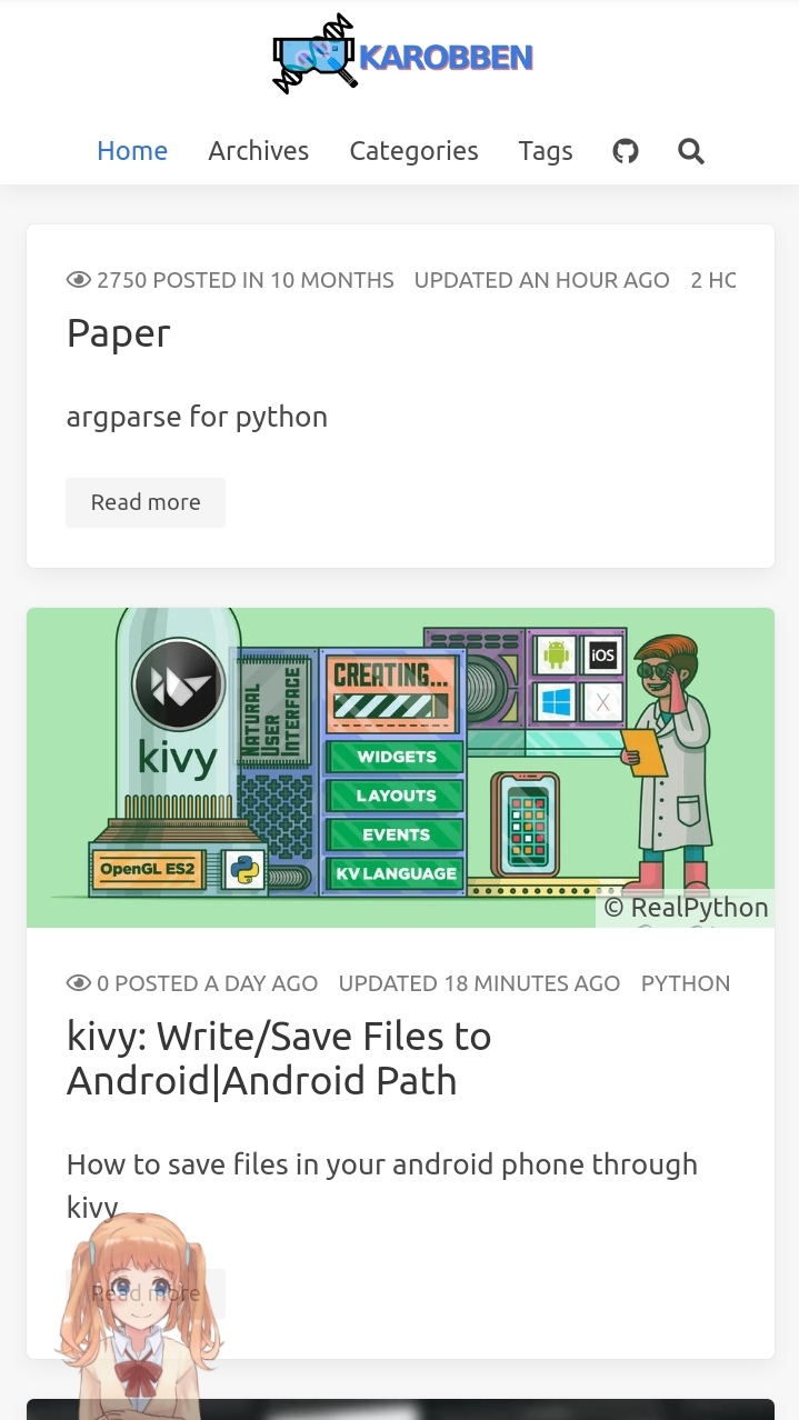 |
|---|---|---|
| © Karobben Before |
© Karobben After |
© Karobben The Final |
And this how I find everything.
By checking the raw codes, we can know the logo was:
|
The class is navbar-logo.
So, by searching this class, we can located it in
|
themes/icarus/include/style/navbar.styl
themes/icarus/layout/common/navbar.jsx
By checking the themes/icarus/layout/common/navbar.jsx, there are nothing we can do.
|
By checking the themes/icarus/include/style/navbar.styl, we now know,
|
Let’s continue to retrive the logo-height
|
themes/icarus/include/style/base.styl
themes/icarus/include/style/footer.styl
themes/icarus/include/style/navbar.styl
Finally, you’ll find this in themes/icarus/include/style/base.styl:
|
Stick the togs (headers/CATALOGUE)
In version V4.0, the scripts in themes/icarus/layout/widget are all gone except profile.jsx. I have no idea why. But by reading the issue #740, I thought maybe I can try to bring it back to the widget. When I firstly copy toc.jsx from hexo-component-inferno, it runs incorrectly:
ERROR {
  err: Error: Cannot find module '../../util/cache'
  Require stack:
  - /media/ken/Data/Github/hexo-icarus/themes/icarus/layout/widget/toc.jsx
  - /media/ken/Data/Github/hexo-icarus/node_modules/hexo-renderer-inferno/lib/compile.js
  - /media/ken/Data/Github/hexo-icarus/node_modules/hexo-renderer-inferno/index.js
      at Function.Module._resolveFilename (node:internal/modules/cjs/loader:923:15)
Obviously, we lack a model named cache.js
So, I checked the repository again and found the util/cache.js at here
Instead of making another directory, I placed the cache.js to themes/icarus/scripts/cache.js and change the path in themes/icarus/layout/widget/toc.jsx
Here’s how I achieved it:
- copy the
cache.jsfrom GitHub tothemes/icarus/scripts/cache.js - copy the
toc.jsxfrom GitHub tothemes/icarus/layout/widget/toc.jsx - Replace the codes:
toc.jsx - const { cacheComponent } = require('../../until/cache');
+ const { cacheComponent } = require('../../scripts/cache'); - Adding the
is-stickyin to theclass[7]:toc.jsx - <div class="card widget" id="toc" data-type="toc">
+ <div class="card widget is-sticky" id="toc" data-type="toc">
|
Change the “latest posts” to “Recommended Post”
One of the sidebars is showing the latest posts. But, yeah, it is unnecessary since everything shows on the home page already. But it’ll be a good place to place your most recommended or valuable posts. By doing that, we need to make a few changes.
For old version[8]:
-
Find
\icarus\layout\widget\recent_posts.ejs:
Change the code 1 to code 2ejs recent_posts.ejs - <% site.posts.sort('date', -1).limit(5).each(post => { %>
+ <% site.posts.sort('priority', -1).limit(5).each(post => { %> -
Change the name of the block: Change the name in language is fine
en.yml - recents: 'Recents'
+ recents: 'Recommend' -
Adding the
priorityat the head of the posts.post.md ---
title: "Hexo theme: icarus"
date: "2021/02/11"
toc: true
+ priority: 1
---
For Version 4.0
As is the situation in above, we need to cp the files, first.
- copy the
article_media.jsxfrom GitHub tolayout/common/article_media.jsx - copy the
recent_posts.jsxGitHub tothemes/icarus/layout/widget/recent_posts.jsx - Alter the require path:
recent_posts.jsx - const { cacheComponent } = require('../../until/cache');
+ const { cacheComponent } = require('../../scripts/cache'); - Alter the codes similar like the old version:
recent_posts.jsx - .sort('date', -1)
+ .sort('priority') - Adding
priorityas same as above:post.md ---
title: "Hexo theme: icarus"
date: "2021/02/11"
toc: true
+ priority: 1
---
It might not work if you didn’t add priority to most of the posts and this takes me a few hours to found it out…
You can use sed to add the priority to all posts:
|
Make sure that the ^thumbnail: is unique to each post.
|
Keep _post directory free with suspicious files
Highlight/Mark
In markdown, we can using the == to mark words or sentences.
But the the default mark would be rendering to yellow: Highlight
And my target is change it to Highlight
Open include/style/article.styl:
|
|
max height for <pre> and <code>
The passage would be looked untidy if the code block or the <pre> block is too long. So, assign the max-height is a good choise.
Since code was embedded in pre, we just need to change pre.
Open include/style/article.styl:
|
|
Abbreviation style
Though abbreviation is convenient in markdown, it is hard to achive in cellphone since there are no suspend events for touch screen. Adding an click event could make it friendly to cellphone users.
Open include/style/article.styl:
|
Abbreviation grammar in markdown:
|
HB
|
Visitor-traffics map
Pick a Visitor traffics map server you like: link
Personally, I’d like to adding it at the end of the profile:
so, the code would be inserted into layout/widget/profile.jsx around line-77.
|
Widget Graphviz
- Install
|
- Adding the script
Added this to layout/common/footer.jsx before </footer>;
|
- (Optional) set the
max-width
If the width of Graphviz is long, it may exceed out of the border.
include/style/article.styl
|
include the code below in graphviz
digraph F {
    rankdir = LR;
    edge [style=solid];
    node [style=filled, font=Courier];

    subgraph M {
        rank = same;
        Start [label = "Lamp doesn't work", shape = box, fillcolor = "#FF0000" ];
        End   [label = "Repair lamp"      , shape = box, color = coral];

        Con1 [label = "Lamp plugged in?", shape = diamond, color = green, size = 3];
        Con2 [label = "Bulb burned out?", shape = diamond, color = green, size = 3];
    }

    subgraph C {
        rank = same;
        RB [label = "Replace bulb", shape = box, color = deepskyblue1];
        AP [label = "Plug in lamp", shape = box, color = deepskyblue1];
    }

    Start -> Con1;
    Con1 -> AP   [label = "No"];
    Con1 -> Con2 [label = "Yes"];

    Con2 -> RB  [label = "Yes"];
    Con2 -> End [label = "No"];

    AP -> End
    RB -> End
}
Strike Style
Open include/style/article.styl:
|
|
Giscus
Origin blog: Yury Zhauniarovich
- Create public repository in your github (like ‘Giscus’)
Pre style
Add the codes below in each of md file
|
Pre block presentation
Just love this style
Hexo theme: icarus| Highly personalize it
