WGCNA - 實戰
WGCNA - 實戰
0. 數據結構
0.1 Expression matrix
Trinity script TPM result
| ID1 | ID2 | Liver_CK | Intest_CK | Muscle_CK | Liver_30 | Intest_30 | Muscle_30 | Liver_75 | Intest_75 | Muscle_75 |
|---|---|---|---|---|---|---|---|---|---|---|
| TRINITY_DN100000_c1_g1 | TRINITY_DN100000_c1_g1_i1 | 2.1 | 4.3 | 1.32 | 1.04 | 4.49 | 2.85 | 3.59 | 4.27 | 1.7 |
| TRINITY_DN100001_c0_g1 | TRINITY_DN100001_c0_g1_i1 | 0.45 | 21.0 | 0.02 | 0.15 | 8.85 | 4.33 | 0.18 | 14.76 | 0.0 |
| TRINITY_DN100002_c0_g1 | TRINITY_DN100002_c0_g1_i1 | 8.39 | 2.01 | 1.08 | 11.32 | 3.2 | 1.1 | 7.83 | 6.23 | 2.91 |
0.2 Traits
| ID | Group | Organ | Weight |
|---|---|---|---|
| Liver_CK | CK | Liver | 33.32 |
| Intest_CK | CK | Intest | 33.32 |
| Muscle_CK | CK | Muscle | 33.32 |
| Liver_30 | SPC30 | Liver | 31.3 |
| Intest_30 | SPC30 | Intest | 31.3 |
| … | … | … | … |
1. Data Clean
1.1 Load and Filter
|
1.2 Clust
|
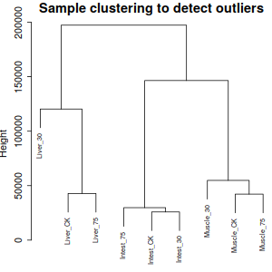
相對來說, Liver30 異質性有點大, 不過, 根據實驗來說, 應該是正常現象,因此跳過刪除異質性項。
|
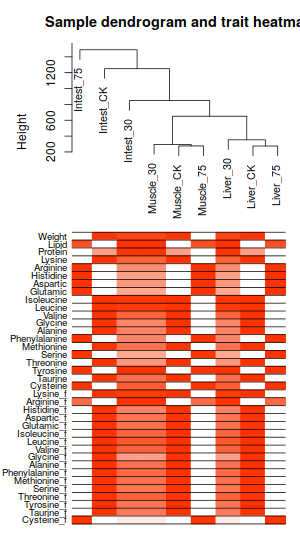
1.3 Loading Traits
|
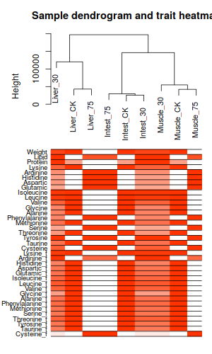
ummm, 並不能看出什麼來。只是個普通的熱圖加樹衛而已
2. Network construction and module detection
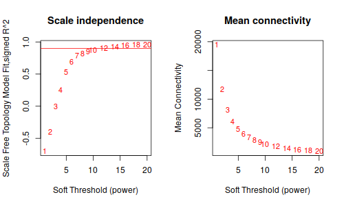
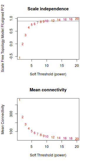
2.1 Pick soft-thresdholding power
|
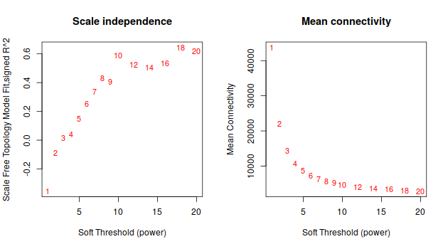
ummm… 等了半天,就這。。。這種垃圾數據的話, 還是放棄把。
3. 刪除不必要reads,再來做一遍
想法: 刪除低hit的reads, 減少計算量,減少垃圾數據的污染
|
然後, 重複上面步驟, 從1.1 datExpr0 = t(A)替換成datExpr0 = t(A_sub)開始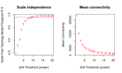
鐺鐺鐺鐺鐺! 這次結果就好看多了把!雖然沒有 Tutorial 那樣標緻,但是,至少給了我繼續下去的勇氣。數據不好,就調高閾值把, 更具這條線,大概是要選9了
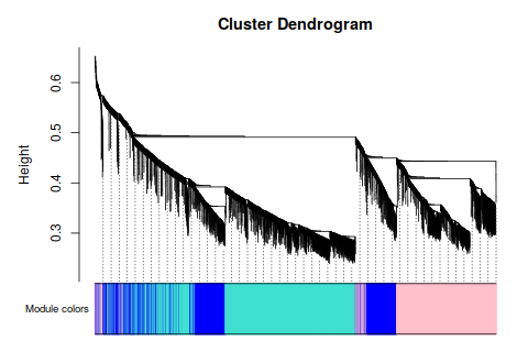
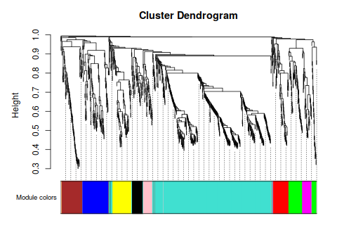
4. One-step NetWork
|
這一步等待時間和你電腦計算能力,基因數量成正相關
|
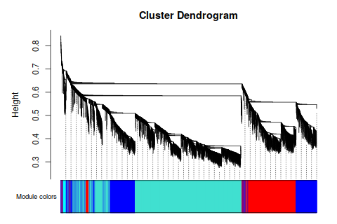
ummmm… 模塊似乎有點寬, 分的不均勻- - 感覺很爛的樣子。 要不再, 篩一下?
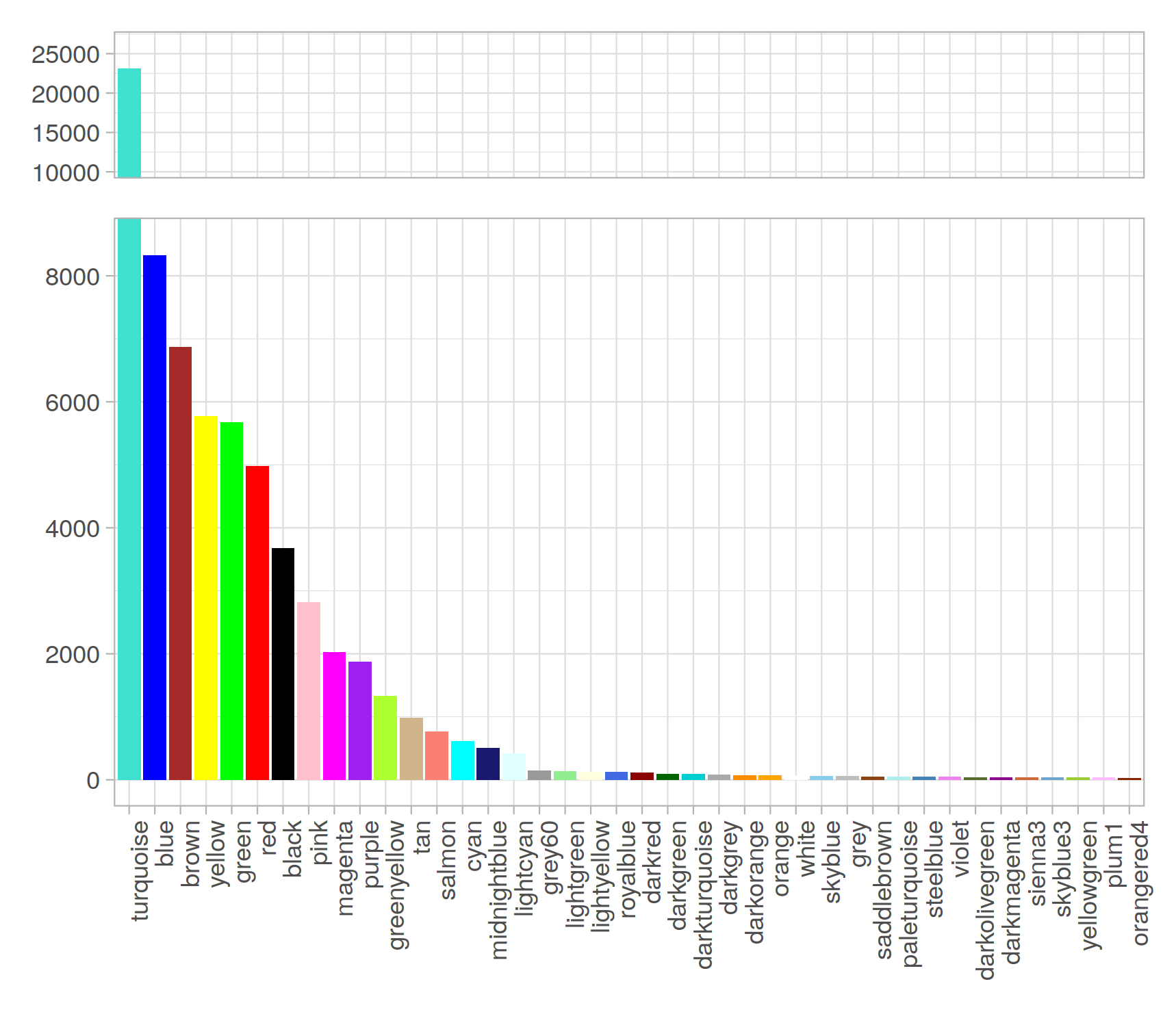
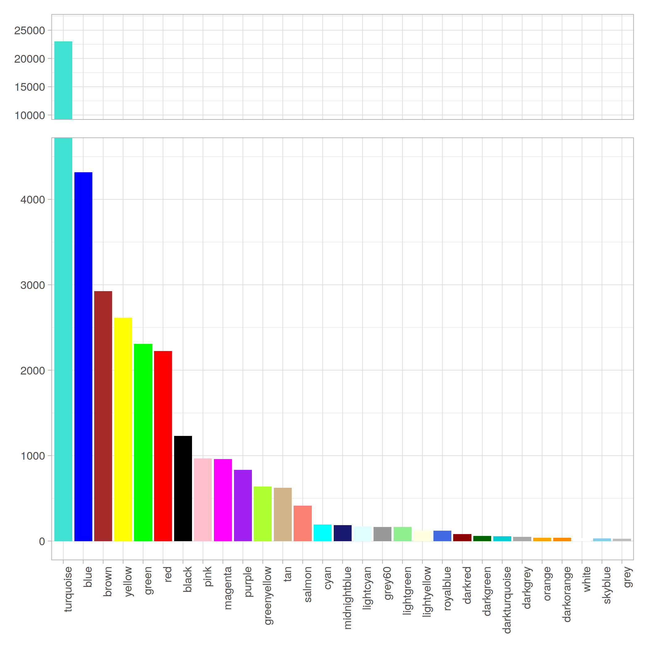
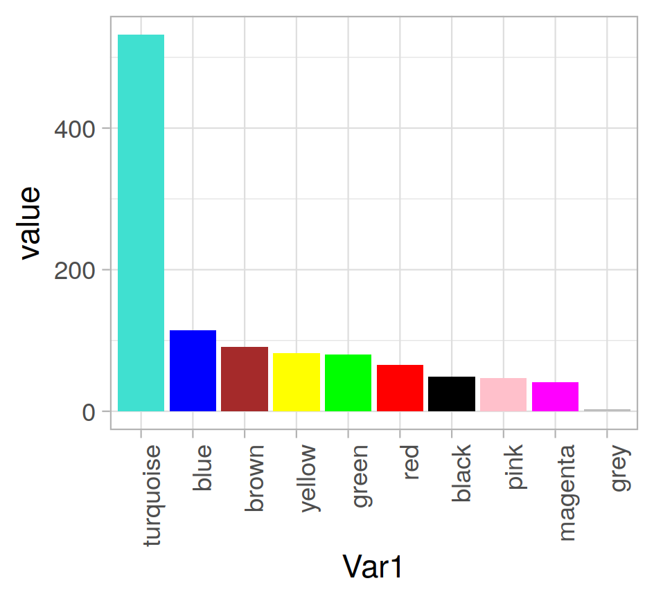
Modules 統計
|
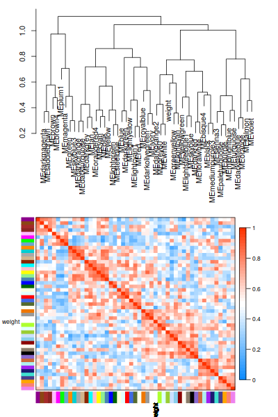
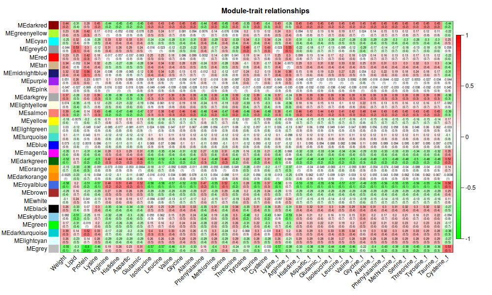
5. Traits
|
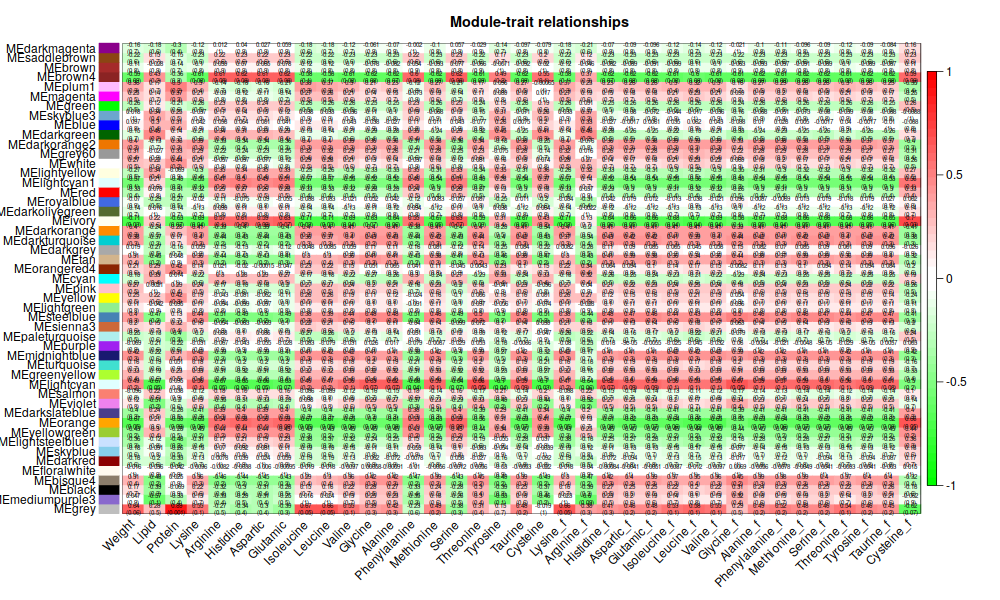
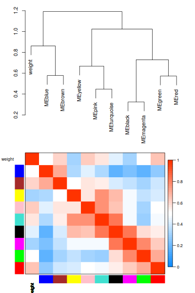
ummm, 能看個大概就好2333.還是有點意思的
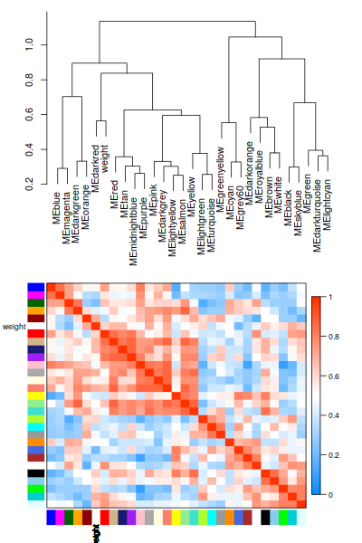
6. Focus on Weight
|
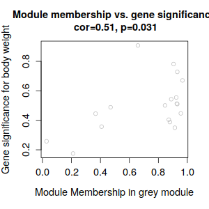
ummmm… 有點少, 哈哈哈, 才18個,數了一下。和tutorial 差好多呀
因爲是非模式物種,所以無法直接用tutorial給的方法做註釋。直接調到後面的可視化把。
7. NetWork Visualizing
|
ummm… 好像是內存爆了,直接退出。 試試不用radian看看失敗了- -放棄, 跳過把參考圖:
|
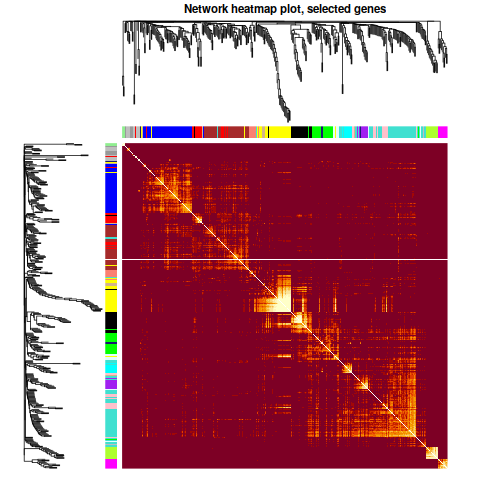
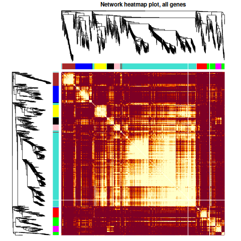
這個圖還是可以畫的
8. 數據導出
|
9. 如果 softThread 還是取6
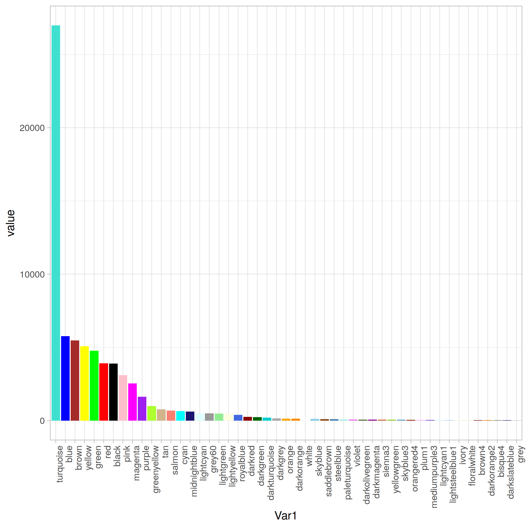
Modules 分佈
|
畫圖函點擊SplitBar
Optimal
A1. Reduce Input Transcripts
這裏, 我們把閾值設定在 45(9*5)
|
剩下了"32.96%"的 Transcripts
接下來退回到1.2
ummmm, 好像還沒之前的好看了- -,
還是取9把,soft
modules 29 個。
traits聚類:
| Cluster1 | Cluster2 |
|---|---|
 |
 |
最亮的沒有上次那麼亮,= =相關係數有點低, 不高
modules 分佈情況:
B. Remove low-hits & Non-DEGs
|
跳回 1.2
ummmm, 這麼篩完以後, 剩下了1105個Transcripts 。。。
| 聚類 | Soft圖 |
|---|---|
| 這次聚類結果,就很不一樣了 | 不過sortpower這個圖,基本還是和前文一樣沒怎麼變。取0.9以上的話, 又得取10了 |
 |
 |
還是去9吧。 1000個,秒算完。先看看分組頻率 和樹圖這個圖,我就覺得,看着舒服多了- -唉
| 聚類 | Soft圖 |
|---|---|
 |
 |
| 第一次畫出Tomplot,激動 | 這個聚類,相關性都不太高呀 |
 |
 |
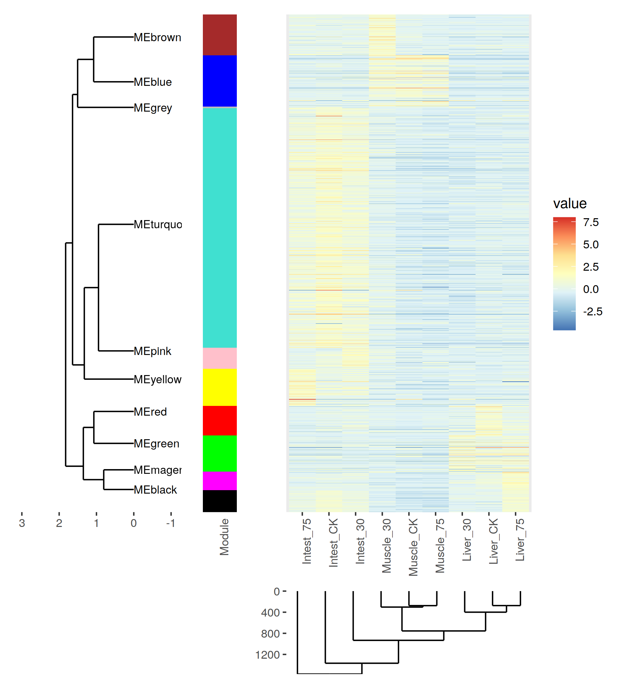
相關性確實是太低了。 我們看一下這1000基因的表達趨勢把。
|
熱圖還是,可以的,就是配色有點麻煩- -
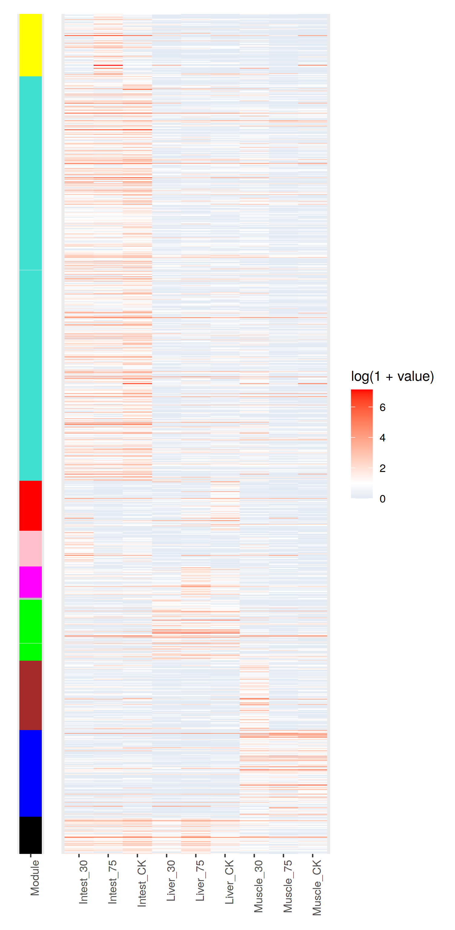
只管來看, 聚類效果還是OK的把。不過correlation值太低了 = = 有什麼之後再去深究把。
添加樹打包兩個函數
|
画图
|