GGradar | ggplot example
geom_tile
KEGG result visualization by ggplot
用 ggplot 畫 hclust 的結果
Response Surface Methodology in R
Nutrition Data Sheet Visualization
Bioconda
geom_boxplot | ggplot examples
Correlation

Correlation

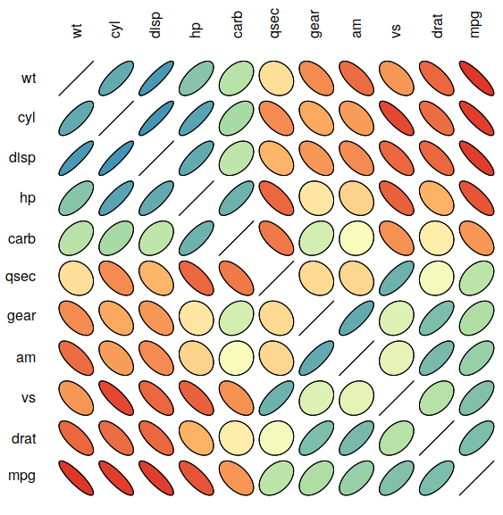
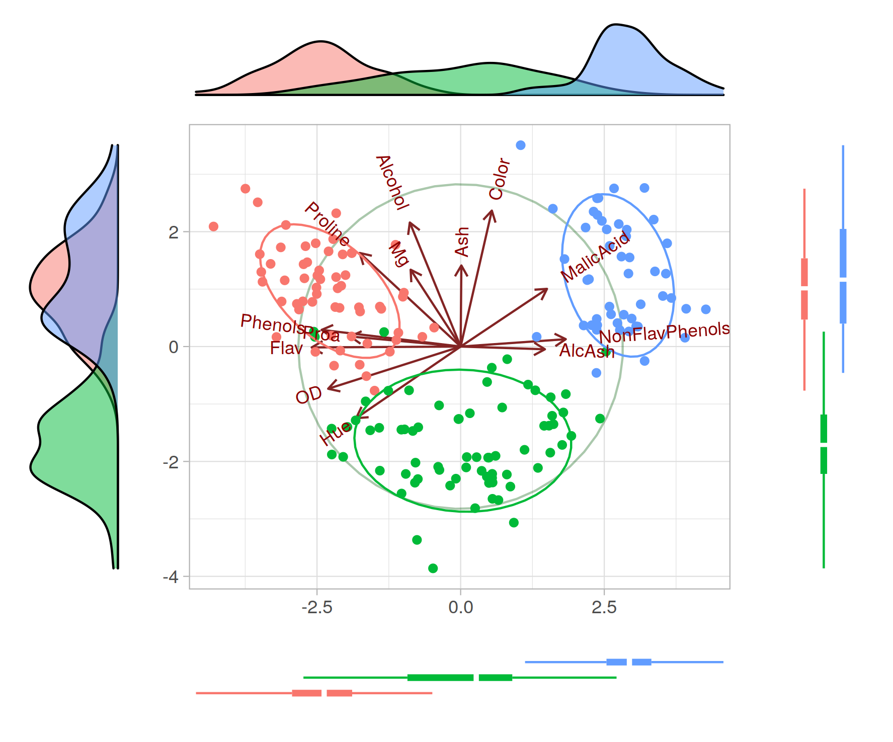
Correlation is a statistical measure that shows how closely two variables are related to each other. We are interested in correlation because it helps us understand the relationship between two variables, make better decisions and predictions, and is used in various fields like finance, economics, psychology, and biology. Who said this?
Read more
PCA and PCoA
3分钟写一个R包
Pheatmap

Pheatmap

pheatmap is an R package for creating heatmaps to visualize large and complex data sets. It provides advanced features such as clustering and annotation, and allows customization of color schemes, row and column labels, and more. The resulting heatmaps can be used to identify patterns and relationships in the data. Who said this?
Read more
R 语言报错集
nCov(新冠状病毒数据获取与可视化)
Ploty

Ploty

heatmap is fun!
Read more